You may have seen this pop-up in your feed recently. Though many will jump to political conclusions or shout we’re being overrun by newcomers, neither is entirely true.
The graphic shows net domestic migration in 2025 per 10,000 inhabitants.
That means the numbers are not percentages and not total headcounts. They show whether a state gained or lost residents from moves within the United States, adjusted for population, so states can be compared on the same basis.
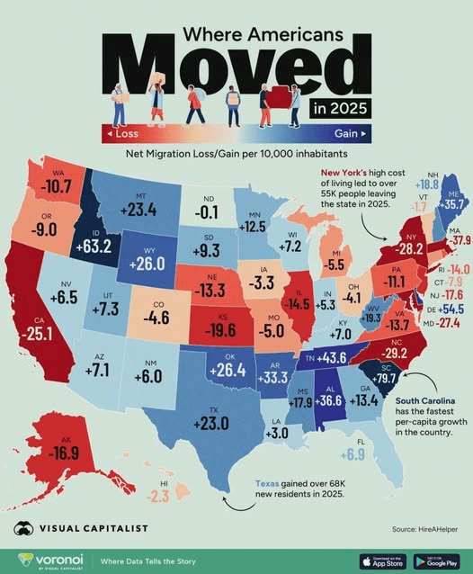
While many states with strong double-digit gains are in the South—such as South Carolina, Tennessee, Alabama, Arkansas, Oklahoma, Texas, West Virginia, Mississippi, and Georgia (in that order)—other southern states had double-digit losses, like North Carolina and Virginia. The remaining southern states (Kentucky, Florida, and Louisiana) had more subdued gains.
Highly populated states such as California, New York, Illinois, Massachusetts, and New Jersey experienced net losses, these losses are almost insignificant relative to their size.
The states with the highest outmigration per capita (in order): North Carolina, New York, Maryland, California, Kansas, New Jersey, Alaska, Illinois, Rhode Island, Virginia, Nebraska, Pennsylvania, and Washington.
Overall, the map suggests the movement is driven more by regional and economic factors such as housing costs, job opportunities, and lifestyle preferences.
Still, these numbers should be kept in perspective.
Even when a state gains or loses tens of thousands of residents, that change is typically small relative to the state’s total population.
Just as important, those gains or losses are spread across multiple metros, suburbs, small cities, and rural areas, often separated by long distances. So a statewide gain or loss may sound dramatic, but on the ground it usually reflects gradual change distributed across many communities, not a sudden shock in one place.
Overall, the data is best read as a picture of directional migration trends, not a sign of an immediate population crisis or boom in any single state.
In Tennessee, 80% of all counties had a higher death rate than birth rate for the latest period (2024-2025).
In Northeast Tennessee, it was 100% of counties.
What does that mean? Without newcomers to offset natural population decline, the population will shrink, businesses will be negatively impacted, and the economy will suffer.
Don’t get me wrong, it’s a slow fade, not a cliff, like boiling the proverbial frog. But it leads to the same conclusion nonetheless.
That’s why it is important to consciously determine the size and type of place you want to live in, then work to preserve and enhance it for future generations.
Sometimes that involves encouraging growth, and other times it means slowing growth. It’s important to choose wisely.
 Kingsport Spirit
Leave a comment